EOIR Public Portal: one accessible path through immigration court for attorneys and the public.
Attorneys, respondents, and the public pieced together immigration cases across a dozen disconnected tools. I led design of one accessible portal for case access and filing.

Impact
• The court's first multilingual case-access application. • Turned a multi-step, disconnected document process into one workflow.
Scope
National DOJ-EOIR platform serving thousands of daily users (attorneys, respondents, and the public) across very different needs and levels of legal familiarity.
Timeline
2021
Role
Lead Product Designer (UX/UI, User Research, Strategy, Prototyping)
The problem: one legal journey, a dozen disconnected tools
EOIR ran on single-purpose tools and manual, offline processes. The goal was one source of truth, accessible to people already navigating a difficult system.

Research: three very different users on the same path
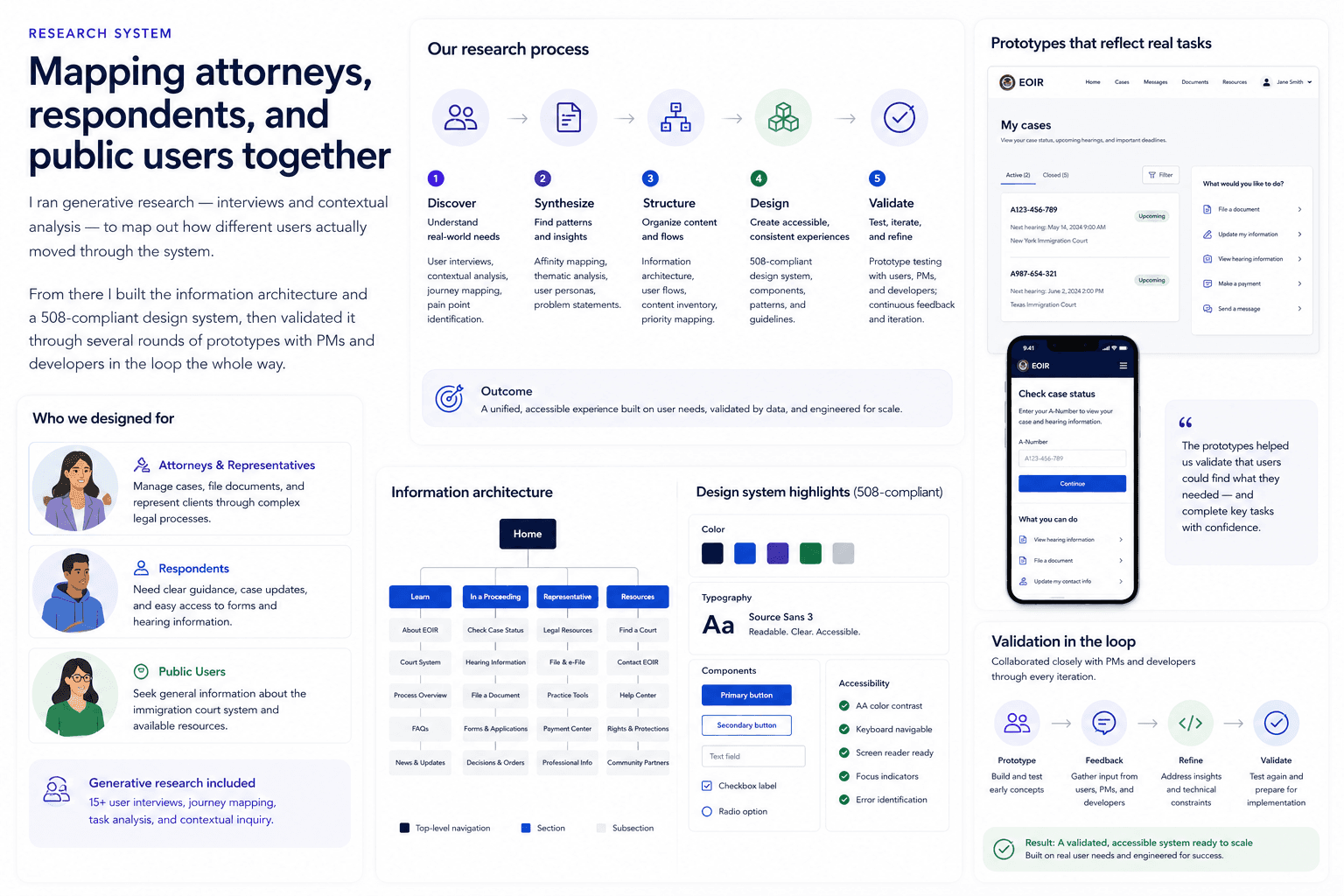
I ran 15+ interviews and contextual research to map how attorneys, respondents, and the public each moved through a case, then validated the structure in several rounds of prototypes.
The insight: fragmentation hurt more than any missing feature
No single missing feature was the problem; disconnection was. People re-entered information, chased status updates, and couldn't see where their case stood.

The calls: fewer steps, earlier errors, one way to submit
Three principles: cut steps wherever possible, validate forms early, and use one consistent pattern for every secure document upload.

The result: adoption up 34%, 1.8M+ filings
A responsive, 508-compliant portal that replaced the patchwork with one journey, and the court's first multilingual case-access experience. Electronic filing replaced physical mail, speeding some legal processing up to 4×.


Takeaways
Consolidation is a UX problem before it's a technical one. Clarity has to work for a first-time respondent without slowing down a career attorney.